


I was recently doing research and writing on the junior mining space as part of a job application and found a compelling chart from Palisade Capital. It shows just how bad things were for the resource industries in 2015. A picture's worth a thousand words and here it is:

This chart from Palisade was published in several places, including here on August 17, 2015. A year later, it looks like they picked a great time to draw attention to the collapse in the Venture. Although it can be problematic to draw sector-specific interpretations from this chart because the Venture Index does contain companies from a broad set of industries, the broad impression is clear: this was a long and severe bear market.
After finding results to the job competition, I noticed a similar chart from Agora Financial published here. This chart reminded me of the one above, except it seems to be designed to give the impression that we are in early innings of a bull market and it is prudent to stay invested. "Ride the bull!"

It is interesting to see both of these charts against each other. Each have caveats, that I discuss briefly below, but I put them together to show you the symmetry between them. First, look how bad things were. Then, look how much better things could get! These are useful tools in building excitement around resource companies.
What next? Apparently the bear market set records for being long and deep. Will the bull phase set new records in a similar way, or will there be some asymmetry in the bull phase? Maybe the current bull run will set a record as the shortest and steepest bull market? Who knows what the future holds, let alone what the word 'bull' and 'bear' market even means to different authors.
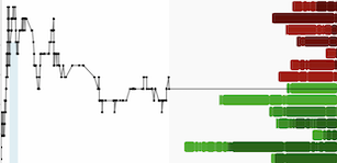
Personally, I encourage more analysis based on these types of charts. In particular, I would like to see analogues that dig below the index to compare how different subsets of companies performed in various market cycles. For example, when have exploration companies led the market higher in the past? Or, have base metal exploration companies ever led the market in a bull phase? Information on which parts of the market are leading or lagging today, and how that compares to past cycles could be interesting for helping observe what is happening out there today.
I also have a couple suggestions for the charts above. One, I would like to see how the last bear market compares to prior ones over a longer sample horizon -- note that the Palisade chart only goes back to 2002, whereas Agora Financial chart goes back to 1940s. Two, I would like to learn more about what counts as a bull market in the Agora Financial chart, and whether authors removed some of shorter bull markets to give impression that we have long runway ahead. These 'analogue' charts can be very powerful, but they are also suspect to problems of data snooping and authors should try to describe the methods behind the results to build confidence amongst savvy readers.

